
Have you ever wondered what makes certain games so engaging that people voluntary chain themselves to chairs and keep on playing till they drop? Is it only about the game’s mechanics or an intriguing plot or is there another secret ingredient?
Most games (both “serious” and “entertainment”) include more or less the same components, such as a basic storyline that sets the context of the game, a list of defined rules to follow and an achievable goal that motivates players to keep on going. Yet, whereas some games make you literally plunge into the fictional universe, other evoke nothing but a wish to log out and forget all about it. Why? Well, there may be a lot of reasons, but graphic design is surely among the most significant ones.

A tool for shaping and enhancing players’ experience
A skillful choice of graphic elements may work miracles, ensuring a player’s interest and enhancing realistic immersion in the fictional world. However, graphic design follows certain rules that – when broken – may completely ruin the game experience. What are these rules, then? First of all, as opposed to purely artistic activity, design always serves the content. Esthetic matters are marginal, and the main goal is to find the form which presents the message in the most adequate and clear way possible. We can distinguish a few major aspects of that form: composition, color, typography and special effects. Let’s discuss them briefly.
Composition
Composition is all about finding right proportions between individual elements, to highlight key information at the expense of less important content. The sum of all parts should be balanced and static, based on regular subdivisions. We avoid the impression of gravitating towards any direction, as well as small differences in sizes and distances. They cause visual discomfort and look like a mistake rather than a designer’s conscious decision. We should group together elements connected by meaning, and care about keeping steady rhythm between them. Visible and invisible lines help us lead the viewer’s eye where we want.
Color
The choice of colors is also important. Firstly, vivid colors attract attention to most significant elements of the composition. Natural connotations they create (e.g. yellow for energy, green for nature), help a viewer navigate in the sea of meanings. Colors can also build depth and space via, e.g., setting together brighter and darker shades of the same hue, or applying a warm hue over a cool background. Harmony and balance can be achieved by choosing colors with a similar degree of saturation.
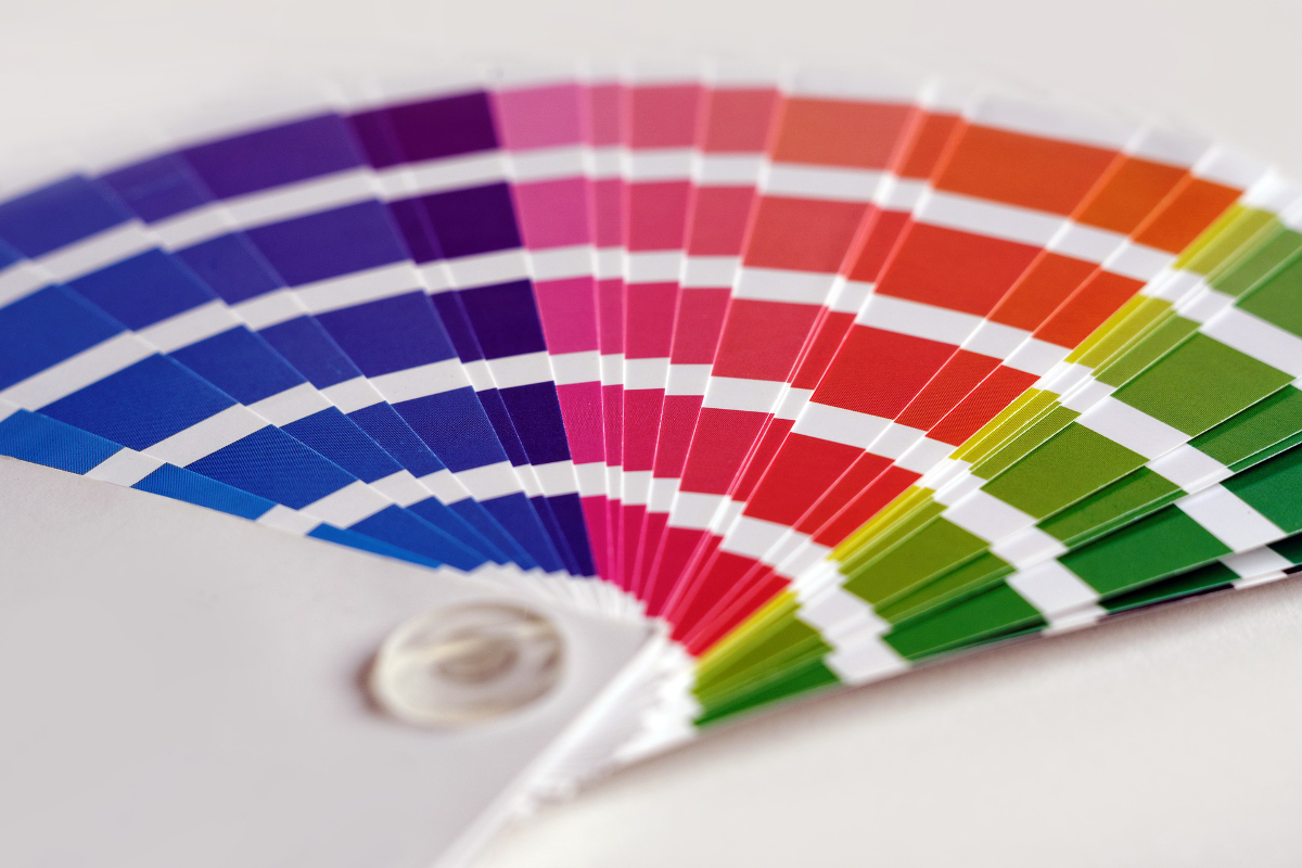
Mixing every color from the palette with the same addition, on the other hand, will work like color filter in photography; it glues different part of the design together. Most attractive juxtapositions emerge between colors from the opposite ends of the color wheel, with additional difference in lightness applied. Importantly enough, color has also the great power of creating mood. A negative effect can be amplified with pessimistic black or warning red, while green highlights the positive feedback.
Typography
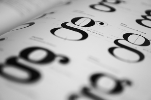
There are not many games out there that are utterly devoid of text. Serious games are especially rich with written word, which is related to their educational function and the multitude of options and various difficulties that need clarification. Basic rules of typography hold true here: we limit the number of font families within one project to 2-3, we don’t combine similar typefaces together, we stick to the rule of leading being approximately 1,4 x font size, we avoid fancy, decorative fonts, and we keep a sufficient contrast between text and background.
Special effects
Special effects are the very last layer in graphic design. Shading helps create illusion of depth. If it is important to recognize the material of which a given element is made, textures come in handy. They can make things more tangible, they are also usable when designer wants to establish a certain character of the whole design (rusty texture as a recurrent element in P.I.P.E.S. game can be a good example). Effects such as gloss and glow suggest interactivity in digital environment.
So much about theory. Now, let’s check how these rules apply to some popular serious games.
Urban Climate Architect
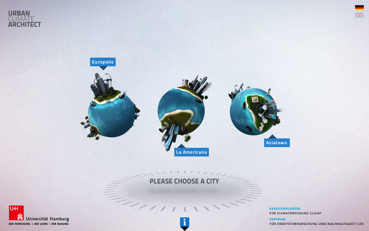
The initial screen is characterised by perfectly symmetrical composition that follows a hierarchical order of elements. 3D models of three cities are clearly separated from each other and are big enough for us to appreciate little details. The main content catches our attention, whereas secondary pieces of information are moved to the corners. The color palette is very limited. Subtle gradients, shadows and a discreet decorative element (namely the circle of lines shown in convergent perspective), create the illusion of depth and space. Add to it simple, sans-serif typefaces and in the result we have a very elegant, clean and modern look.
Things are getting a little bit worse in the next step. An unnecessary, new typeface is introduced, the composition looks unbalanced and the placement of buttons is counterintuitive.
Fortunately, the situation gets better with another move. The main screen of the game offers a perfect example of a skilfull selection of colors. Red alerts scream for our attention, and we can immediately understand that the three big indicators in the right bottom corner will be very important during the game. I also like how designers solved the need for displaying information; to read the detailed description of a selected item, we have to drag it and drop it on the “i” icon. All the clickable elements are clearly differentiated from the subdued background. Little animated details, such as clouds and birds, add life and motion to the scene.
Every move provides immediate feedback for a player: the animated indicators increase or decrease; whereas the tooltips provide information about threats and investments necessary for keeping the balance in the urban environment.
Actually, the graphic design of “Urban Climate Architect” is worthy of a better case. Deceived by great visuals, we expect something closer to computer strategy games and all we get here is simple, repetitive mechanism of balancing indicators, which gets boring way before we complete the map.
3rd World Farmer
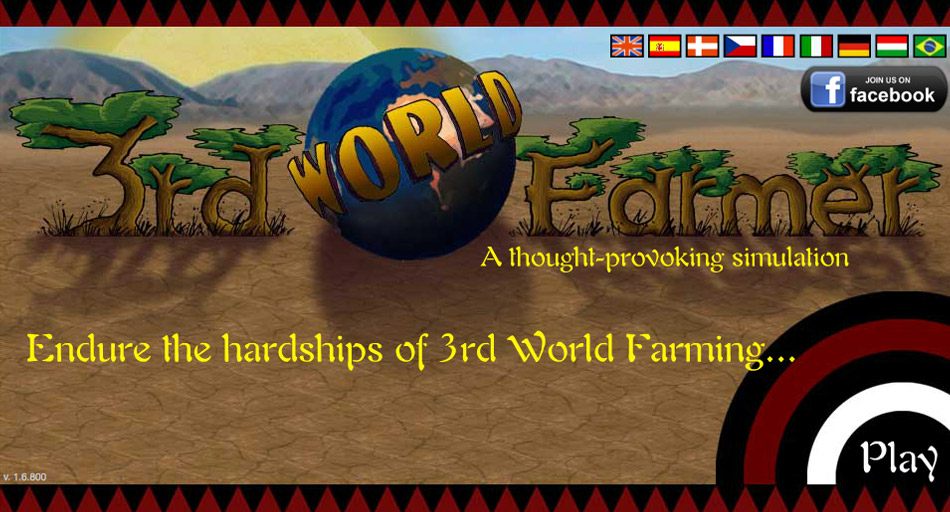
The initial screen may overwhelm a viewer with an abundance of surprising elements, such as unreadable letters in the shape of trees or the word “world” illustrated by a globe (could it be more obvious?) The language choice is signalled by as many as 9 flags (while it could be hidden under a simple drop-down menu) which – together with the flashy yellow letters – make us think that we are entering an amusement park rather than a village in the distant regions of Africa. After a moment to enjoy the biggest bullet-points in history of mankind, we can start the game.
The icons are blurry and small. Luckily enough, tooltips help us identify the objects (if you can read microscopic texts, of course). The prices are small too, and sometimes even partially covered by images (this problem is repeated multiple times across various places in the interface). Visual distinction between available and unavailable investments is way too subtle.
The further into the game the more disencouraging it becomes. For example, instead of brief, singular descriptions of family-related statistics and available actions, we have to scroll through one enormous wall of text which covers all aspects of managing a family, in order to find the information we need. However, this screed reveals itself only if we are inquisitive enough to press the modest question mark in the character card. What is more, after clicking the ‘money’ icon, we are presented with the entire list of items, along with the recommendation: “press green buttons to sell items for the prices given”. There are no green buttons until you actually make some goods, but you have to figure it out by yourself. The annual report is full of information, and it is difficult to tell which piece of it is the most relevant. Was it a good or bad year? Also, sliders behave differently in the report and in the help window.
I’m sure a lot of effort was put into the game’s content. Each round introduces new events; there is a plethora of things we could build if we could ever afford them. Too bad that illegible interface and obsolete design diminish the player’s experience. With the proper UI solutions and more contemporary graphics, the “3rd World Farmer” could be a real hit.
Magnitude Game
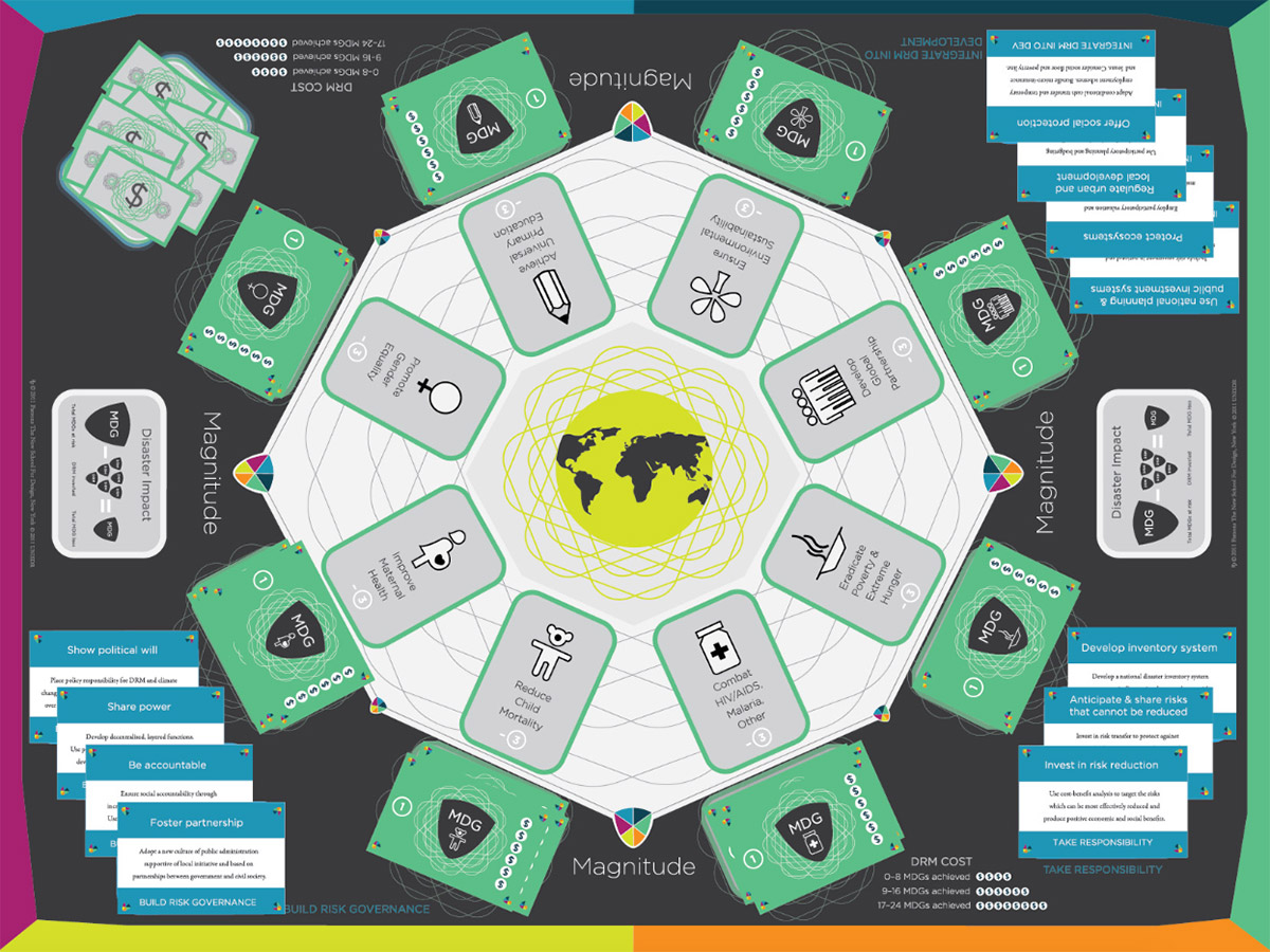
A fine example to illustrate that although “simpler is better” it may sometimes deprive the design of distinctive features.
The consequent use of a limited color palette and typography ensures the legibility of the design. The rosette-like ornament and the shield shape (taken from the logo) repeat in many places, which is a signal of designer’s awareness; but overall flatness and stock simplicity of icons could be taken as a flaw. Sparingly used textures or gradients, and more carefully crafted images instead of contour pictograms could make the whole design more attractive and alive; now it seems a bit cold and soulless. I would also replace the (nowadays overused) grotesque font in headlines to something more distinct and expressive, but this is really a matter of taste more than pointing out a mistake.
In summary, Magnitude Game looks solid and correct, if unmemorable. It is a good starting point for future improvements.
I hope that the examples presented here are strong enough to show the importance of proper graphic design, even (or maybe especially) in the genre which is not so famous for its striking visuals. Play the Urban Climate Architect to see how attention to detail and carefully made graphic components can bring the not-so-absorbing game to the next level. Check out 3rd World Farmer and imagine how amazing it would be with an interface designed to actually help the player orienting in a multitude of options, instead of working against him. And if you plan to create a game on your own, hire a professional graphic designer who will save you from glaring mistakes and provide at least correct and solid results – just like the Magnitude Game.